Wednesday


Experimenting with layout similar to andy Warhols electric chair!


Andy Warhol


This is an Andy Warhol inspired portrait I did this by playing around with the saturation.

Monday

What is Fine Art Photography?

I am working on my power point presentation and was researching how Fine Art photography can be defined. this is what i came up with:
It can be called "art photography," "artistic photography," and "fine art photography"
*Wikipedia describes it as:
"a high-quality archival photographic prints of pictures that are created to fulfil the creative vision of an individual professional".
* Fine art photography is one form of photography that I found hard to define.
Primarily because artistic value and beauty is very much in the eye of the beholder. What one person describes as aesthetically beautiful may be completely different to the next person.
* It has been described as ‘photography created purely for the sake of expressing the photographer's own vision and feelings’. (Dena Kane)
*Through researching a variety of famous ‘Fine Art Photographers’, I have found that although Fine art can be of a personal opinion, listed fine art photographers works are always resolved at a very high standard. Clear, correct colour balance, correct density, resolution, ect. What ever method they may use to capture their photograph traditional, digital, the way in which they have captured/manipulated and resolved the overall image is almost perfect.

2 week break: Country Placement

What I learnt on Country placement!
Im doing country school placement so this was my first time in school for the year.
It was great being able to teach the year 11 and 12 students techniques i had learnt in photoshop this year. I taught them how to create a montage of themselves, how to make their photo black and white while recovering parts of the image in colour, curves, eliminating imperfections and more. It was also a great oportunity to learn from the students as well.
Although i did not have access to the internet or a camera for two weeks i was able to build skills that will help me manipulate my photoshoots further.

Manipulating photoshoot!


Photoshoot: Richard Avedons Marilyn Monroe
My inspiration for my photoshoot was Richard Avedons Marilyn Monroe portraits. I wanted to re- create these portraits but change them and make them my own style.
I used a staged shoot where i set up lighting to set a sensual seductive type mood. I used a room with a plain white background where i could change the setting as i liked. I picked the colour red as a theme throughout the shoot as i feel it is a classy yet seductive colour that would suit marilyn monroes personality.
I found a costume that was suitable for the subject to wear and noted how her hair and makeup was done so i could copy it best as possible.
Here are some of the photos from the shoot. I have manipulated some of them.


COLOUR: Week 6 continued..

Today I also leant how to colour an image black and white while revealing certain parts of the image in colour! These are the notes I noted down as i was learning.
* Select image
* Adjustmensts: make b/w
* Click two adjoining circle button on the right tool bar (to make it a separate layer on top)
* Click back to the origianal picture and erase the area you want to come back in colour.
It reminded me of the movie 'Pleasantville' where parts of their world start to form in colour.
I used an image from the photoshoot i took in week 5 , that i hadent started manipulating yet.

I love the way it turned out I am really happy with it!

Photos from week 3- back tracking


I went on an art excursion and we visited the lane way in the city that has amazing graffiti art! The colour,detail and scale of the work was just amazing.
It got me thinking about some photos of tattoos i took during week 3, could tattoos be an interesting theme? could i incorporate it into my developed theme?
I did a couple of trials manipulating the tattoo photos slightly.

This one i just played around with the curves too and cropped the image slightly. I like the composition of this shot and i like the way the hair brushes past her shoulder.

The Buddha tattoo was manipulated by simply using the curves tool. This was to bring out the bold outline of the tattoo. I cropped the image so that the main focus was the tattoo. I love the Asian style beads at the bottom on the wrist it adds to the style of the tattoo.
The second photo I put into black and white then again used the curves too to manipulate the brightness and contrast of the image allowing the tattoo to stand out more. This photo was also cropped slightly.

Week 6 MONTAGE

As i was absent during week 5 when we learnt how to create Montages, Bec and I watched an instructional clip that stuart created and learnt how to do it. I absolutely loved it and I cant wait to do another one!

This is the practice one we did at Uni. We didnt have a tri pod so we used a bin instead, which featured at the bottom of the image unfortunately, but we cropped it out.


Inspirational artist 2!


David LaChapelle
David Lachappelle is another photographer Ive always loved. I love his bright wildly imaginative scenes that more often than not depict celebrities doing wild and outrageous things.
LaChapelle was born March 11th 1969 in Fairfiel USA.
He is a photographer and director who works in the fields of fashion, advertising, and fine art photography and is noted for his most surreal outrageous style. His style is combination of reportage and surrealism really.
He is highly influenced by the media and felt that if the media was "Loud and opinionated" then that is what hes images were going to be.
* I love the way he often appropriates famous painting or portraits and recreates them as his own. eg: LaChapelle "Last supper", his Andy Warhol appropriated portrait of Elizabeth Taylor.
He also mentioned on that Andy Warhol was in fact is ultimate Idol and was in fact the founder of LaChappelle as a photographer.

His images are always so vibrant but also crisp and clear where you are able to see every part of the image in detail. I love his use of lighting effects (although more than often added on photoshop).
*This has finally helped me to decide my final theme of 'Re-creating famous portraits'.

Inspirational artist!


Richard Avedon
Richard Avedon has always been a favorite of mine. He has been my inspiration
for producing previous works and i just love his series of photographs of Marilyn
Monroe. Avedon was born in New york in 1923. He was able to make an early career in fashion photography when he was discovered by Alexey Brodovitch the art director of Harper's Bazaar. By 1946 Avedon had set up his own studio and began providing images for magazines such as vogue and life.
In one website it mentions that Avedon was best known for making his subjects feel comfortable this in effect is why he delivered such emotional images that capture the moment perfectly.
* Looking at his Marilyn Monroe pictures specifically, got me thinking about creating a theme "Recreation/ appropriating famous portraits". I thought maybe recreating a Marilyn Monroe portrait would be interesting. But i would like to put my own spin on it and change it to make it a modern day recreation.

Easter Break!


My cusin and I decided to build a huge octopus figue out of seaweed and sand. It turned out really great! and the setting added to the overall look!

Final portrait


I just realised i uploaded the wrong portrait of my dog this is the finished one, with no green eyes :)

Trial 2:
I used the hue/saturation tool to turn the image black and white. I then used the curve tool to darken the image slightly so that the detail was still evident.

Sunday

Self portrait task!

This was my self portrait :)

I chose my dog Coco as she is a huge part of my family and we all have a really close bond with our dog. With this image i fixed up the colours slightly on photo shop as there was a bit too much orange in the photo. I also used a dodge and burn tool to darken the lighter spots on the edges of cocos outline.


This is one of the original image before photo shop manipulation.

NGV 'REVIEW'


"The question is not what you look at but what you see" Henry David Thoreau
I went to see the exhibition at NGV titled 'Review'. There were many different style photographs within this exhibition. Different mediums, eras and subject matter. Here are my favorite works from the exhibition;
by Huang Yen 1966 'Chinese landscape tattoo'. My year 12 theme for art was body art or body paint i did a series of works where i painted on the body, so i loved this piece. Colours are all complementary to one another i love the earthy tones. At first you view it simply as a painting then you look more closely to see the painting on a human canvas :)

This photograph of a still life installation is by Man Ray, 1933, a gelatin silver photograph. What i liked most about this photo was the shaddows created by the unusual subject matter. The composition is beautiful and is said to be a self portrait of Man Ray. " The globe held in a disembodies white hand, contains a reflection of the photographic studio and cameras flash as a reminder of the artist who created this stylish and slightly un settling portrait of himself".
Marcel Broodthaers, Belgium 1979 'Le soupe de Deguerre' type C photograph.
This image interested me as i liked the layout of the overall piece. It is almost like looking through 12 tiny windows to see whats on each table. The shots look like little Polaroid photographs or shots from a photo booth. It has a sort of pop art effect in the way it displays a sort of mass media food production. Food that everyone should be eating.

At the market


I vistited the Vic Market on a saturday morning. Again using my Uncles camera I decided to have a go at taking some photos of food :) The colours were so vibrant and the compositions very interesting, this is what i came up with..


The scallop shot was one of my favorite photos of the day, i love the clarity along with the overall composition works really well. I love the shapes that overlap as well as the deatailed textures.


By looking at the meat pictures, I can almost smell that sickly smell that is so dominent while walking into the butchers or through the meat section at the market. I love the compositions again, the croppping allows the image to become more of an artistic peice rather than a documentary/advertisement photograph of the markets produce.

Slow shutter mixed with movement!

This is photo i took the day after of the students participating in sport. I decided to trial a very slow shutter speed but put the camera in automatic. The slow shutter created this ghostly like effect that i found looked quite effective. It is almost like you can see the childs previous path really quite scary looking.

March 26th ;This week I borrowed my Uncles Panasonic Gf1 to begin experimenting with my initial idea of movement and action. I decided to steer away from staged shoots for a moment to try something new. I chose children and thorght id have a go getting some action shots of students at my afterschool care (with parent permission slips) :)
I love this image as i feel it captures the moment really well. Only thing was when i took the photo i was standing a little too far away which took away from the detail a little. I cropped the image to capture the emotion in the students faces.
There are many more photos i manipulated in this shoot, however I rather not put them on the internet as I explained the photos were strickly for viewing in the university classroom.
See my USB.
Experimentation this week in photoshop....
* Doging and burning
* Curves tool
* Saturation
* Colour balance
* Lighting effects

Class experiments continued...


Photo of a stranger: I love this photo as it is not your typical portrait of a stranger however still complete strangers moving in their everyday life. I think it captures the moment well. slow shutter speed used to create the blurry effect. Slightly under exposed.

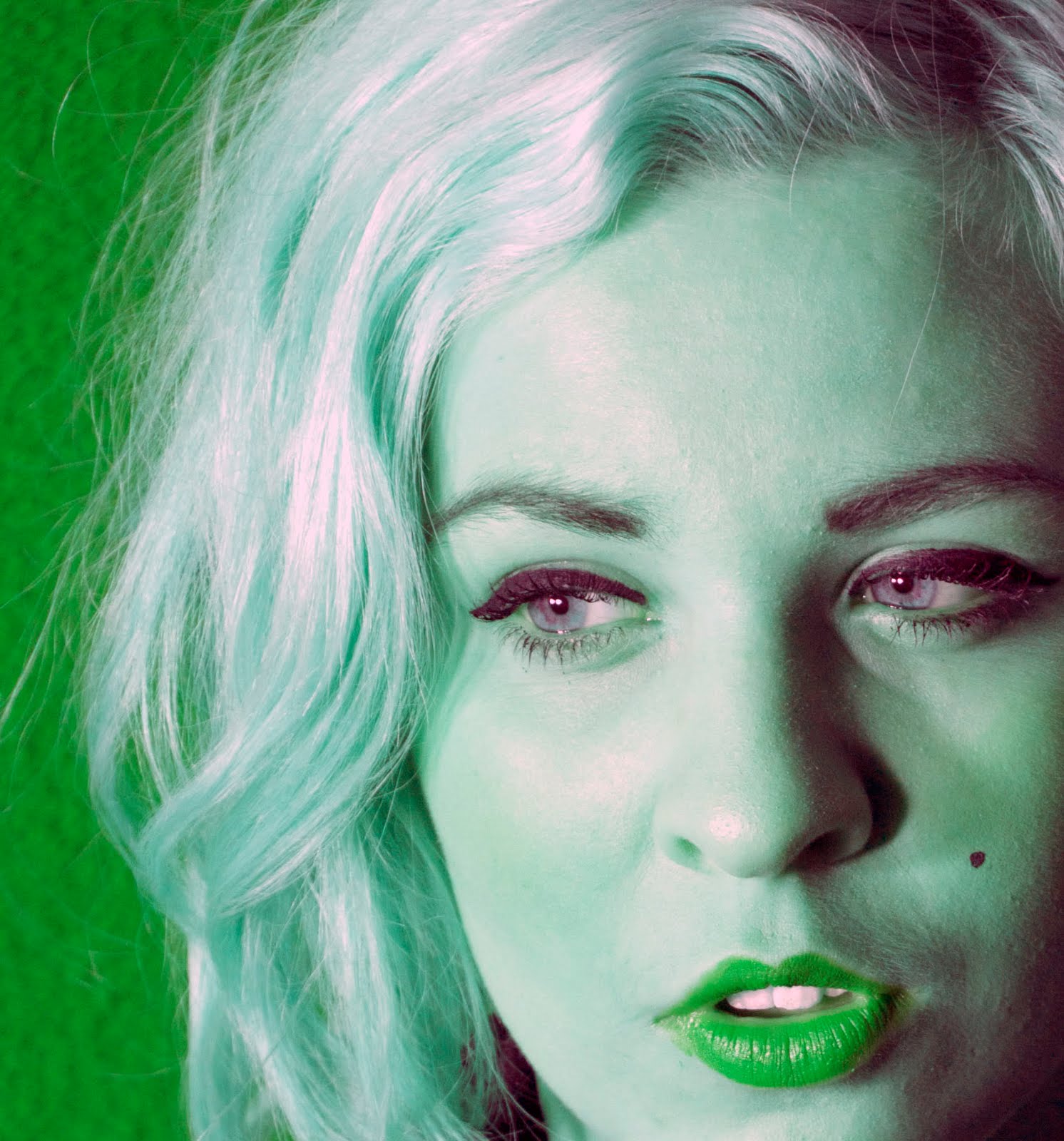
Tasty: My interpretation of tasty is slightly less literal but kind of pop arty. I cropped this image to get the composition of images more up close and personal. The colours remind me of an old style milkbar sign very classic.

Reflection: This is a self reflection of me taking the photo while still keeping the smoking sign in clear focus. Here i was also experimenting with focus for ground and background, here the foreground is in focus while the background is very blury.

Reflection 2: This was taken in the old water fountain pool a reflection of the sky gave a quite dull and stormy effect where it was actually quite clear that day.

Path of vision: This is a good example how a path of vision leads the viewers eyes down into the photograph. I like the composition in this photo also as i find the viewer has no choice but to follow down the stone path.

Up close: Here again i was playing with focus i switched from having the foreground in full focus to having the middle ground and background in full focus while the foreground (subject 1) being out of focus. I feel it gets the viewer to look deeper into the image as well as forget about the up close subject at the front of the image.